In part one, we introduced the idea of programming by example, but didn’t actually implement it. Instead we took an example of a classification problem - identifying penguin species based on their measurements:
import pandas as pddf = ( pd.read_csv("https://raw.githubusercontent.com/allisonhorst/palmerpenguins/master/inst/extdata/penguins.csv", ) .dropna() # missing data will confuse things)[['species', 'bill_length_mm', 'flipper_length_mm']]import seaborn as snssns.relplot( data = df, x ='bill_length_mm', y ='flipper_length_mm', hue ='species', height=8, hue_order = ['Adelie', 'Gentoo', 'Chinstrap'])
and manually wrote a function to do the classification:
Looking at the above function, we might notice that the code is extremely specific to this problem - it will not help us if we have a different number of species, different measurements, or different distributions of classes.
A more general approach
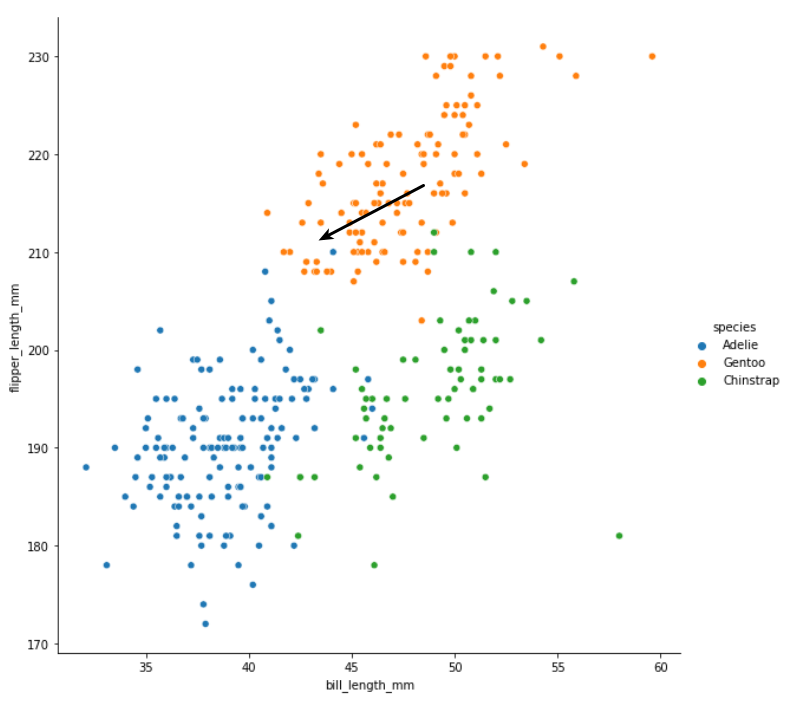
It would be nice to have a more general solution that we could apply to any classification problem. Let’s begin by doing a little manual classification experiment. Pretend we have measured another penguin and we don’t know the species. We’ll add this new penguin to the chart and try to guess the species:
In the above chart, the black arrow is pointing to the measurements of the new penguin - imagine there is another marker right at the tip of the arrow, and we have to decide which colour it belongs to.
Do you have your answer? I think that most people would intuitively say that this new penguin is a Gentoo penguin i.e. it belongs to the orange cluster. If asked to explain our choice, we might point out that most of the points closest to our new point are orange. A couple are blue, but it makes perfect sense here to go with the majority.
Let’s try to turn this intuitive line of reasoning into a set of steps that we can implement as code. When we have a new point, we should:
calculate the distance to all of the other points
find the other points that are closest
count up how many of the closest points belong to each species
guess that our new point belongs to whichever species there is most of
Onto some code
Now for the code: we can do this step by step using pandas. For an example, we will say that our new penguin has a bill length of 43mm and a flipper length of 211mm.
The most tricky step is calculating the distance. We can easily calcuate the difference in flipper length between each existing point and our new one:
For an explanation of the pandas magic that makes it possible to operate on complete columns in a single expression, see chapter 3 of the Biological exploration book.
Notice that in both outputs we have a mixture of positive and negative numbers. To find the overall distance between our new point and each of the existing ones, we can use Pythagoras. We square each distance, add them together, then take the square root of the result:
# we need numpy's sqrt function to operate on complete columnsimport numpy as npoverall_distance = np.sqrt( # we want the square root of... flipper_length_difference **2# the square of the flipper distance+ bill_length_difference **2# plus the square of the bill distance)overall_distance
For convenience, we will add this as a new column to our dataframe:
df['distance to new point'] = overall_distancedf
species
bill_length_mm
flipper_length_mm
distance to new point
0
Adelie
39.1
181.0
30.574663
1
Adelie
39.5
186.0
25.597851
2
Adelie
40.3
195.0
16.676031
4
Adelie
36.7
193.0
19.821453
5
Adelie
39.3
190.0
21.759825
...
...
...
...
...
339
Chinstrap
55.8
207.0
11.516944
340
Chinstrap
43.5
202.0
9.124144
341
Chinstrap
49.6
193.0
18.578482
342
Chinstrap
50.8
210.0
5.885576
343
Chinstrap
50.2
198.0
14.001428
333 rows × 4 columns
Now we can sort our dataframe by this new column:
df.sort_values('distance to new point')
species
bill_length_mm
flipper_length_mm
distance to new point
158
Gentoo
45.4
211.0
0.400000
204
Gentoo
45.1
210.0
1.004988
236
Gentoo
44.9
212.0
1.004988
274
Gentoo
45.2
212.0
1.019804
194
Gentoo
45.3
210.0
1.044031
...
...
...
...
...
31
Adelie
37.2
178.0
33.909291
98
Adelie
33.1
178.0
35.080051
122
Adelie
40.2
176.0
35.327610
20
Adelie
37.8
174.0
37.694031
28
Adelie
37.9
172.0
39.641014
333 rows × 4 columns
Notice how the points that end up at the top of the sorted table have measurements very close to our new point (45mm and 211mm). Using head we can select just the closest points - for now let’s arbitrarily say that we want the ten closest:
df.sort_values('distance to new point').head(10)
species
bill_length_mm
flipper_length_mm
distance to new point
158
Gentoo
45.4
211.0
0.400000
204
Gentoo
45.1
210.0
1.004988
236
Gentoo
44.9
212.0
1.004988
274
Gentoo
45.2
212.0
1.019804
194
Gentoo
45.3
210.0
1.044031
152
Gentoo
46.1
211.0
1.100000
244
Gentoo
45.5
212.0
1.118034
198
Gentoo
45.5
210.0
1.118034
166
Gentoo
45.8
210.0
1.280625
129
Adelie
44.1
210.0
1.345362
Now we can easily see by looking at the first column that we have nine Gentoo penguins and one Adelie penguin among our closest points. But let’s do this final step in code too:
( df.sort_values('distance to new point') # sort by distance .head(10) # take nearest ten ['species'] # get the species column .mode()[0] # find the most common)
'Gentoo'
Note that we need mode()[0] in the last step because the mode method returns a series, as there might be multiple values that are equally common. We can imagine various different ways of breaking a tie, but for now we will just pick the first.
And turning this into a function
Taking all of these steps together, we can turn them into a function that will start with a bill length and a flipper length, and return the guess for the species:
def guess_species(bill_length, flipper_length):# calculate distances and add to the dataframe flipper_length_difference = df['flipper_length_mm'] - flipper_length bill_length_difference = df['bill_length_mm'] - bill_length overall_distance = np.sqrt( flipper_length_difference **2+ bill_length_difference **2 ) df['distance to new point'] = overall_distance# find closest points and calculate most common species most_common_species = ( df.sort_values('distance to new point') .head(10) ['species'] .mode()[0] )# the most common species is our guessreturn most_common_species
This function looks kind of complicated, but it’s just implementing the same rules that we humans follow intuitively. Let’s check that if we put our original new point in we get the same output:
guess_species(45, 211)
'Gentoo'
Of course, we can try some other points now as well:
guess_species(40, 190)
'Adelie'
and get different outputs.
Exploring the new function
Now that we have a function where we put in a pair of measurements and get out a species prediction, there are a number of interesting things that we can do with it.
Testing the function
One thing we can do is to run the prediction function for each of the real penguin points:
guesses = df.apply(lambda p : guess_species(p['bill_length_mm'], p['flipper_length_mm']) , axis=1)guesses
At first glance our function seems to be performing quite well, guessing right 95% of the time - but we will come back to this point later!
Exploring the prediction landscape
Another thing that we can do is run our function on many different pairs of made up measurements and visualise the results. For example we can take all the bill lengths between 35mm and 60mm:
and plug each combination into our function to generate a guess:
for bill_length in bill_lengths:for flipper_length in flipper_lengths: guess = guess_species(bill_length, flipper_length)
These data will be easiest to work with if we turn them into a dataframe:
data = []for bill_length in bill_lengths:for flipper_length in flipper_lengths: guess = guess_species(bill_length, flipper_length) data.append((bill_length, flipper_length, guess))data = pd.DataFrame(data, columns=['bill_length', 'flipper_length', 'prediction'])data
bill_length
flipper_length
prediction
0
35
170
Adelie
1
35
171
Adelie
2
35
172
Adelie
3
35
173
Adelie
4
35
174
Adelie
...
...
...
...
1495
59
225
Gentoo
1496
59
226
Gentoo
1497
59
227
Gentoo
1498
59
228
Gentoo
1499
59
229
Gentoo
1500 rows × 3 columns
Now see what happens if we plot these made-up points using the same code we used to plot the real points:
sns.relplot( data = data, x ='bill_length', y ='flipper_length', hue ='prediction', height=8, hue_order = ['Adelie', 'Gentoo', 'Chinstrap'])
We see how the evenly spaced grid of points shows us what the prediction would be for a new point that falls in various parts of the chart.
Here’s the same chart but with a more tightly spaced grid (going up in steps of 0.2mm rather than 1mm):
bill_lengths = np.arange(35, 60, 0.2)flipper_lengths = np.arange(170, 230, 0.2)data = []for bill_length in bill_lengths:for flipper_length in flipper_lengths: guess = guess_species(bill_length, flipper_length) data.append((bill_length, flipper_length, guess))data = pd.DataFrame(data, columns=['bill_length', 'flipper_length', 'prediction'])sns.relplot( data = data, x ='bill_length', y ='flipper_length', hue ='prediction', height=8, hue_order = ['Adelie', 'Gentoo', 'Chinstrap'])
With a bit of matplotlib magic we can place this prediction plot side by side with the plot of the real points and see how our function captures the overall shape of the different clusters:
import matplotlib.pyplot as plt# make two plots side by sidefig, (ax1, ax2) = plt.subplots(1, 2, figsize=(15,6))sns.scatterplot( data = df, x ='bill_length_mm', y ='flipper_length_mm', hue ='species', hue_order = ['Adelie', 'Gentoo', 'Chinstrap'], ax = ax1)sns.scatterplot( data = data, x ='bill_length', y ='flipper_length', hue ='prediction', hue_order = ['Adelie', 'Gentoo', 'Chinstrap'], ax = ax2)
I think it’s really interesting to see how the complex shapes in the right hand chart emerge naturally from the very simple rules of our function.
For comparison, here’s a similar prediction chart for the rules that we manually implemented in part one:
bill_lengths = np.arange(35, 60, 0.2)flipper_lengths = np.arange(170, 230, 0.2)data_part_one = []for bill_length in bill_lengths:for flipper_length in flipper_lengths: guess = classify_penguin(bill_length, flipper_length) data_part_one.append((bill_length, flipper_length, guess))data_part_one = pd.DataFrame(data_part_one, columns=['bill_length', 'flipper_length', 'prediction'])import matplotlib.pyplot as pltfig, (ax1, ax2) = plt.subplots(1, 2, figsize=(15,6))sns.scatterplot( data = df, x ='bill_length_mm', y ='flipper_length_mm', hue ='species', hue_order = ['Adelie', 'Gentoo', 'Chinstrap'], ax = ax1)sns.scatterplot( data = data_part_one, x ='bill_length', y ='flipper_length', hue ='prediction', hue_order = ['Adelie', 'Gentoo', 'Chinstrap'], ax = ax2)
Notice how the manually created if/else rules create much more artifical shapes.
Summary
We’ll stop there as that’s quite a lot of new material and code. Although the function that we wrote in this part and the one that we wrote in part one have similar input and output, the approach they take to classification is completely different. Crucially, the function from this part doesn’t contain hard coded, manually determined rules - its behaviour is completely determined by the real points that we start with.
There are plenty of questions left to answer about this function! How do we properly test it (hint: the way that we did it above is definitely not correct)? How do we figure how the best number of close points to include in the counting? And is this function general enough to help us with other classification problems?
We will take a look at all of these questions in the next part of this series. If you want to make sure you don’t miss it, sign up for the newsletter at the bottom of this page.